Initace
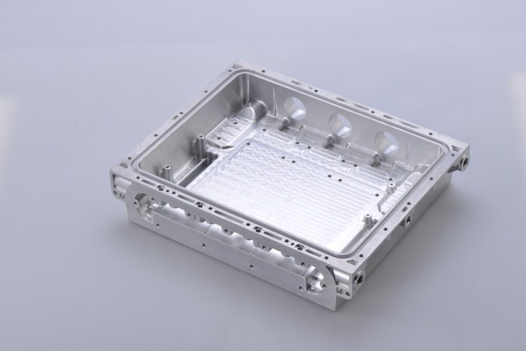
A product page that persuades people to buy has four elements in the right order: a clear image showing the product as it really looks, a visible price with no need to click, clear information about availability, and one distinct action button — not several equal buttons fighting for attention in the same place.
An image that shows the product honestly
The first image in the product list should show the product alone on a calm background, not a composition with props — that makes it easiest to compare products with one another. On the product page, further down the gallery, photos in use, close-ups of the material and at least one photo that shows scale make sense: the product in a hand, on a person, or next to an object of known size. The customer cannot touch the product, so the photos must answer the questions they would ask in a physical shop.
A visible price
A price hidden behind “ask for a price” or visible only after logging in discourages customers in consumer stores — every extra step is a chance to compare the offer elsewhere. In sales to businesses it can be justified by individual pricing. If the price depends on the variant, it is worth showing a price range already in the product list.
Clear information about availability
“In stock” or “ships within 24 hours” next to the add-to-cart button builds confidence in the purchase. Right beside it, show the delivery cost and date and a short note on returns, with a link to the full rules. Without such information the customer has to guess or look for it elsewhere — and the more steps, the easier it is to give up.
One distinct action button
A product page with several equal buttons (add to cart, add to favourites, compare, ask) scatters attention. The main action — adding to the cart — should stand out clearly from the background; the other options can be smaller or tucked behind a labelled icon.
A 5-minute test on a phone
Many product page problems show up only on a small screen. Open your three most-bought products on a phone and check:
- Whether the price and the “Add to cart” button are visible without scrolling, or whether the button is easy to find after scrolling past the images.
- Whether you can zoom into the image with your fingers, and whether the zoomed image shows details rather than blurred pixels.
- Whether, for a product with variants (size, colour), choosing a variant changes the image, price and availability.
- Whether the description gives specific dimensions, material and composition, as ordinary text and not only in an image — text in an image is read by neither a search engine nor a screen reader.
- Whether you know how much delivery will cost and when the parcel will arrive before you tap the button.
Every “no” is a specific fix that can be made without rebuilding the whole store.
In short: an honest image, a visible price, clear availability with the delivery cost, and one distinct button — check them on a phone, because that is where many customers view your store.
Planning a new store or a refresh of your product pages? See Online store.